The Humble Doodle That Became the World's Default Language for Explaining Things

The Humble Doodle That Became the World's Default Language for Explaining Things
Walk into almost any workplace in America and you'll find one. It's on the whiteboard in the conference room, half-erased from last Tuesday's meeting. It's on slide fourteen of the investor presentation. It's taped to the wall in the break room explaining what to do if someone has a food allergy. Boxes connected by arrows, decisions shaped like diamonds, endpoints circled for emphasis.
The flowchart is everywhere. It is, arguably, the most widely used diagram in the world. And it was invented not by a scientist, not by an engineer, and certainly not by a tech company. It came from a management consultant who was desperately trying to make industrial mess look like orderly progress.
The Man Who Hated Wasted Motion
Frank Bunker Gilbreth was obsessed with efficiency in a way that made his contemporaries look relaxed. A former bricklayer turned industrial engineer, Gilbreth spent the early 1900s studying how workers moved through physical tasks and looking for ways to eliminate unnecessary steps. He called this "motion study," and he was extraordinarily serious about it.
Gilbreth worked alongside the broader scientific management movement — the school of thought pioneered by Frederick Winslow Taylor that tried to turn labor into something measurable, predictable, and optimizable. But Gilbreth had a specific problem that Taylor's approach didn't fully solve: how do you communicate a process clearly to someone who has never seen it before?
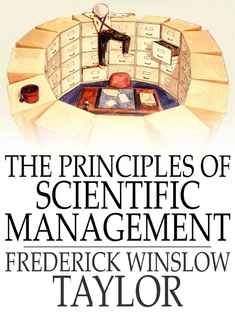 Photo: Frederick Winslow Taylor, via imgv2-1-f.scribdassets.com
Written instructions were too slow to read on a factory floor. Verbal explanations got distorted as they passed from manager to foreman to worker. Gilbreth needed a visual shorthand — something that could show the sequence of a process, the decision points within it, and the outcomes at every branch, all at a glance.
The 1921 Diagram That Changed Everything
In 1921, Gilbreth presented a paper to the American Society of Mechanical Engineers titled "Process Charts — First Steps in Finding the One Best Way to Do Work." In it, he introduced a standardized set of symbols for mapping industrial processes: a circle for an operation, an arrow for movement, a square for an inspection, and so on.
It wasn't quite the flowchart as we know it today — the diamond shape for decision points came later — but the core logic was identical. Steps flowed in sequence. Branches showed alternatives. The whole thing could be read in minutes by someone who'd never set foot in the factory being described.
The response from the engineering community was immediate and enthusiastic. Here was a tool that made invisible processes visible. Factory managers could map an entire assembly line on a single sheet of paper. Supervisors could identify bottlenecks without walking the floor. And new workers could be trained faster because they could see the whole picture before touching a single machine.
From Factory to Government to Your Laptop
The diagram migrated out of factories faster than anyone expected. By the 1930s, government agencies — always drowning in procedural complexity — had adopted process charting to map bureaucratic workflows. The military used it extensively during World War II to coordinate logistics and training programs. If you needed to explain how something worked to a large group of people who came from different backgrounds, the flowchart was the answer.
The real acceleration came in the 1940s and 1950s, when computer programmers adopted the format wholesale. Herman Goldstine and John von Neumann, working on early computing systems at Princeton, formalized the flowchart as the standard way to represent programming logic. The diamond shape for conditional decisions — the "if this, then that" branching point — became a fixed part of the vocabulary during this period.
When personal computers arrived in the 1980s, software like Visio put flowchart-making tools directly in the hands of office workers. Suddenly you didn't need a draftsman or a consultant. Anyone with a mouse and fifteen minutes could map a process, plan a project, or explain a procedure. The flowchart democratized itself.
Why It Escaped the Factory
Here's the genuinely strange part of this story: a diagram invented to map the movement of physical objects through industrial space is now routinely used to map abstract ideas that have nothing to do with manufacturing.
Therapists use flowcharts to help patients trace the logic of anxiety spirals. Elementary school teachers use them to teach narrative structure in reading comprehension. Human resources departments use them to explain what to do if you witness workplace misconduct. Startup founders use them in pitch decks to show how a user moves through a product experience.
None of these are factory processes. None of them involve bricklaying or assembly lines or motion study. But all of them share the same fundamental challenge that Gilbreth was solving in 1921: how do you take something that happens in sequence, with decision points along the way, and make it instantly understandable to someone who's never seen it before?
The answer, it turns out, is always boxes and arrows.
The Most Invisible Innovation
Flowcharts are one of those inventions so thoroughly absorbed into daily life that they've become invisible. Nobody thinks "I'm using a Gilbreth process chart" when they're sketching out a decision tree on a napkin. The format has become synonymous with thinking itself — with the act of breaking something complicated into steps that can be followed.
Frank Gilbreth died in 1924, three years after introducing his process chart system. He never saw it escape the factory floor. He never saw it on a whiteboard in a therapy office or embedded in a kindergarten worksheet about story structure.
He just wanted to make bricklaying more efficient. The rest of us figured out that his solution worked for pretty much everything else too.